
KavaChart in Action - Examples and Documentation - ProServe
[ Back ] ProServe Chart Samples
All these pages are created using KavaChart's tag library, but they could as easily have been created using scriptlets or servlets. Take a look at the JSP source code to the pages to see how they work. You will generally use a database or web service to obtain data for your charts, and will probably want to separate the chart style information from the rest of the page. See the tag-library and scriptlet examples for information about handling external styles, internationalization, and dynamic data handling.
These samples are organized into 4 collections:
All the charts share a core of functionality, covering data handling, hyperlinks, and general chart properties like color palettes and labeling.
Note: these charts all run in "demo mode" and display a notice at the bottom until you install a license key.
It's worth browsing through all the samples to see if there's a specialized chart that is uniquely suited for your needs. You can also browse the KavaChart HTML documentation from these pages, or download the KavaChart ProServe User's Guide in PDF format. The PDF documentation can be printed for a handy desktop reference.
You can also use the KavaChart Chart Wizard to prototype you chart designs without becoming familiar with KavaChart's style properties.
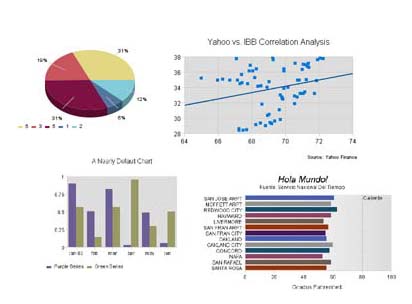
Basic Charts |
|
|
This collection includes the most used chart types, including most varieties of Bar, Pie, and Line charts. The Basic collection demos include:
Like all ProServe charts, these charts support hyperlinking, tooltips dynamic data, and a wide range of style and data input features. Feel free to experiment with these samples to see how chart properties can modify chart appearance. |
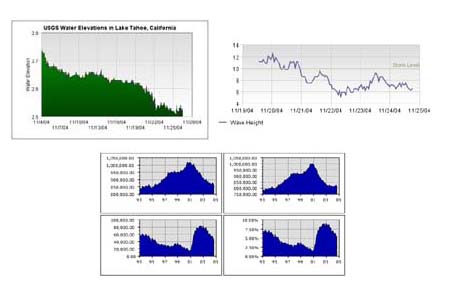
The Timeseries Chart Collection |
|
|
KavaChart's Timeseries chart collection includes sophisticated timescale handling. Data that ranges over a period of time can be represented as areas, lines, strip charts, or bars, with clear, intuitive axis labelling that happens automatically. Timeseries demos include:
|
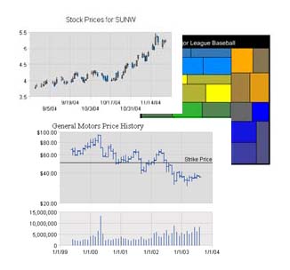
Finance Chart Collection |
|
|
KavaChart's finance charts include some of the most popular chart types used to analyze financial data. For more sophisticated charting and technical analysis, see the "kcfinance" package, part of the KavaChart Enterprise Edition. If you need professional level technical analysis, or wish to implement a complete trading application with real-time data and news feeds, contact contact info@kavachart.com for more information about our Visual:ProChart technical finance charting products. The Basic Finance collection includes:
|
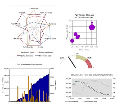
Specialty Chart Collection |
|
|
KavaChart includes a range of charts that are used for specialized applications. While these charts aren't seen as often as, say, a bar chart or pie chart, they're extremely useful for certain situations. The specialty charts include:
|