
KavaChart Gallery
|
Charts and graphs can be an extremely powerful and efficient method for
communicating information. We think of "consuming information at-a-glance"
as the litmus test for whether a chart communicates effectively. We believe in the elegance of simplicity. What that means in a general sense, is that more often than not, less is more. Charts that allow a user to consume information at-a-glance, not only look good but convey, rather than obscure information. We know from years of experience that it's more difficult to create well-designed charts that look good, and communicate effectively, than the fancy 3-D, gradient filled, image boosted "power" charts, we are accustomed to seeing. |
Sure,
we do 3-D effects, gradients, image maps, scrolling, panning and various
other animations, after all, we're software developers and our goal
is to provide you with the best tools possible to create any type of chart
you want.
In fact, KavaChart can produce an almost limitless variety of visuals to
represent your data. The charts in our gallery are representative of the
kinds of charts you can create for your own application. These gallery samples
tend to reflect our bias for simplicity but there are plenty of complex ("feature
rich") examples as well. The point is, you're not limited to what you see
here. And, if you're wondering whether we support a chart type or special
effect you don't see, we probably do but ask, and we'll let you know. |
Chart Categories
Horizontal & Vertical Bar Charts
 |
Horizontal Bar |
 |
Horizontal Stacked Bar |
 |
Vertical Bar |
 |
Vertical Stacked Bar |
 |
Horizontal Floating Bar |
 |
Vertical Floating Bar |
Line Charts
 |
Line (time-series) |
 |
Line Chart (categorical) |
X-Y Scatter Charts
 |
Scatter |
 |
Regression |
Multi-axis Charts

|
Bar/Area or Bar/Line |

|
Bar, Line or Area |

|
Line/Line |
||
Pie Charts

|
Pie |
Area Charts

|
Stacked Area |

|
Area |
Combination Charts

|
Bar/Area |

|
Line/Bar |
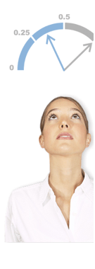
Speedos (Gauges)

|
Speedos |
Finance Charts

|
Candlestick |

|
Bar or Stick |
Special Purpose Charts
|
Beyond the extensive gallery of out-of-the-box charts there is literally no limit to the charts you can create using KavaChart. The special purpose charts here don't include a variety of others that are available such as Histograms, Stem-Leaf charts, Box-Whisker plots, Box-Jenkins plots, Pareto charts, and numerous interactive charts (zooming and scrolling) -- to see a few interactive demos, go to AlaCarte applet demos. |
|||

|
Bubble |

|
Sector Map |

|
Radar |

|
Gantt |
