
Helpful Links:
KavaChart in Action - Examples and Documentation - ProServe
[ Back ] ProServe Chart Tag Examples
|
KavaChart ProServe's tag library is the easiest and most efficient way to add
charts to most JSP environments. Because chart tags look a lot like any other
HTML tag, they're as easy to add to your page's layout as an image or a table.
They separate programming and visual design tasks so you won't have to adjust
Java code to change the appearance of your charts. And the tags hide messy
optimization and localization details that make chart rendering and delivery
as fast as possible.
These demonstration pages show a variety of ways to use the tags. You'll find charts that are cached on your server's local disk, charts that are streamed, charts that are distributed to a mirrored server cluster (if your server is set up that way), charts rendered as images, and charts rendered as Flash© movies. |
Some of these pages use locally
contrived data (usually random numbers), and others reach out to other web servers to
generate real time charts from public data. Every example has source code you
can experiment with to see
what KavaChart can do for you.
At the bottom of this page you'll find documentation and other useful links.
Interactively create style sheets for your tags with the online Chart Wizard.
|
|
Run jsp
See source
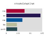
A very simple streamed chart. This chart uses a very simple <chart> tag to generate a fairly complex chart. The chart is rendered on a page with both text and image information, and it includes tooltip labels over each bar. |
|
|
Run jsp
See source
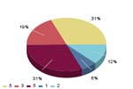
This page combines dynamic form data with a Pie Chart definition to generate a chart. Since it's a Pie Chart, we use antialiasing in our style to smooth the edges. |
|
|
Run jsp
See source
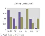
Chart tags can also use a variety of inner tags to modify styles, data, locales, and so on. This page is similar to the first example, but uses inner tags to override various chart properties. |
|
|
Run jsp
See source
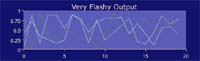
Chart tags can also dramatically simplify creating SVG and Flash© output. These formats require special <OBJECT> tags, which are automatically generated by the ProServe chart tag. This example also demonstrates ProServe's automatic load balancing feature. |
|
|
Run jsp
See source
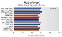
So far, our examples have used random numbers. This example uses live XML data from a Web Service to describe the current temperatures in San Francisco Bay Area cities. This sample also demonstrates an important feature of ProServe tags: you can localize your chart images by simply creating ResourceBundles that reflect the localization changes. |
|
|
Run jsp
See source
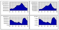
Building on the concept of using live external data to drive our charts, this page collects government census information from the Bureau of Labor Statistics, and then uses ProServe data filter tags to create multiple charts from the same data sources. Using form data to manipulate data sources, this page creates a complete application to visually browse through California labor statistics. |
|
|
Run jsp
See source
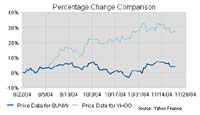
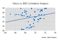
The next example looks at live financial data from the Yahoo! web site and examines how you can use ProServe's data tags to dice and slice your data, and come to a better understanding of the underlying data. In addition to conventional Candlestick charts, this page displays a regression chart / scatter plot, and a time series that lets you compare the percentage change in stock prices between Yahoo and any other stock. |
|
|
Run jsp
See source
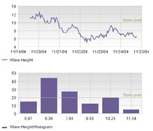
This sample examines real-time weather data from a buoy off the central California coast. Since the buoy data access is rather slow, we optimize the page by putting our data source into a persistent resource. The page also demonstrates how to use a ProServe "datahistogram" tag to generate a histogram from raw data sources. |
|
|
Run jsp
See source
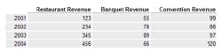
This page demonstrates ProServe's "table" tag, and the "datatranspose" tag. KavaChart's tags are designed to help you understand data. Sometimes that means presenting data in multiple ways to help viewers understand it from different perspectives. |
|
|
Run jsp
See source
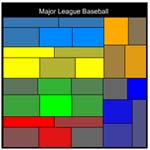
The last example combines a number of ProServe tag samples to create a chart that describes Major League Baseball at the end of the 2004 season. This is a "sectormap" chart that combines a number of elements into a single visual. This chart also hyperlinks each square to the web site of the team it represents. |
|
The data sources:
A Simple Random Number DataProvider
Employment Data DataProvider
Monterey Bay Bouy DataProvider
Bay Area Weather DataProvider
Yahoo! Finance DataProvider