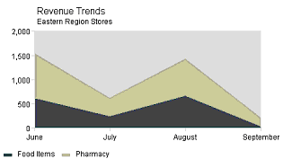
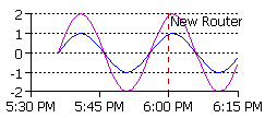
dateAreaApp assumes that X values are
time
stamps. This is appropriate for charts that have irregular
observations, or for charts that have many observations:
There are several ways to supply timestamp data. You can use dataset properties, such as dataset0dateValues to define a set of timestamps using inputDateFormat to describe formatting. You can also use raw numeric values (the number of milliseconds since 1970 UTC) for dataset0xValues. If you're implementing a DataProvider or overloading one of the getDataset() methods, you can create datasets using java.util.Date objects or java.sql.Date objects. This chart can take advantage of generalized date chart properties and date chart axis properties.
Area Chart properties include:
| Property | value type | effect |
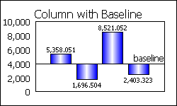
| baseline | double | sets the baseline value for this
area. Note: stacked areas are
not visually appropriate for charts with ascending and descending
values. |
| stackAreas | true/false | determines whether the areas will be stacked on top of each other (default is true) |
There are several ways to supply timestamp data. You can use dataset properties, such as dataset0dateValues to define a set of timestamps using inputDateFormat to describe formatting. You can also use raw numeric values (the number of milliseconds since 1970 UTC) for dataset0xValues. If you're implementing a DataProvider or overloading one of the getDataset() methods, you can create datasets using java.util.Date objects or java.sql.Date objects. This chart can take advantage of generalized date chart properties and date chart axis properties.
RegressApp runs a simple linear regression calculation on the data values passed into this chart.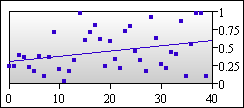
| Properties | value type | effect |
| plotLinesOff | anything | Create a scatter plot by making plot lines invisible |
| individualMarkers | true/false | If markers are used, this property determines whether or not the datum markers will be used rather than the dataset marker (default is false). |
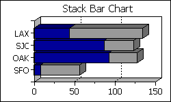
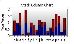
stackBarApp and stackColumnApp stack
data
series rather than clustering them.
There are several ways to supply timestamp data. You can use dataset properties, such as dataset0dateValues to define a set of timestamps using inputDateFormat to describe formatting. You can also use raw numeric values (the number of milliseconds since 1970 UTC) for dataset0xValues. If you're implementing a DataProvider or overloading one of the getDataset() methods, you can create datasets using java.util.Date objects or java.sql.Date objects. This chart can take advantage of generalized date chart properties and date chart axis properties.
Bar Chart properties include:
| Property | value type | effect |
| barBaseline | double | bars ascend or descend from this value |
| barClusterWidth | double | This determines how wide each bar should be. If the value is 1.0, bar 1 will touch bar 2. If the value is 0.5, each bar will take 50% of the available space. If you have more than one data series defined, this value describes the total width of a cluster of bars. |
| datasetNImages | list | a list of image URLs for use in representing dataset N (creates a pictogram with image texture type) |
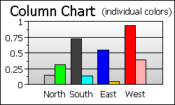
| individualColors | true/false | In bar/column charts that normally use only the Dataset color for drawing bars this will determine whether datum colors should be used instead (default is false). |
| useValueLabels | true/false | determines whether the bar labels are the dataset labels or just the y values (default is false) |
| dataset0y2Values | list of doubles | Auxilary Y values in bar charts are used to create standard error bars for scientific analysis. |
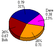
Pie slice colors are defined using dataset0Colors.
SpinningPie is an applet that lets users manipulate the rotation value with mouse drags.
Pie Chart properties include:
| Pie Chart Properties | value type | effect |
| explodeSlice | integer | slice number to explode |
| explodeSlices | list of doubles | This will be list of explosion values for each slice. Explosion values should be between 0 and 1, but generally pretty close to 0. The default value when a slice is exploded with explodeSlice is .05 |
| textLabelsOn | anything | make string labels visible |
| valueLabelsOn | anything | make numeric labels visible |
| percentLabelsOff | anything | make percentage labels invisible |
| percentPrecision | integer | the number of digits of precision for Pie percent labels |
| labelPosition | integer | 0: at center of slice, 1: at edge of slice, 2: outside edge of slice with pointer |
| startDegrees | integer | degrees counterclockwise from 3 o'clock for first slice |
| xLoc | double | x Location for center of pie (between 0 & 1, default 0.5) |
| yLoc | double | y Location for center of pie (between 0 & 1, default 0.5) |
| pieWidth | double | % of image for pie diameter (default .6 = 60%) |
| pieHeight | double | % of image for pie diameter (default .6 = 60%) |
| lineColor | Color | redefines the color used for pie slice pointers |
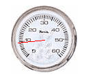
HSpeedoApp adds a "high-water mark" to show where the maximum value of the gauge was.
This chart draws one indicator for each
dataset. By default, the scale is calculated based on all the
dataset values, even though only the first value of each dataset is
actually displayed.
| Speedo
Chart Properties |
value type | effect | ||||||||||||||||||
| needleStyle | integer | Kind of needle (default 1) 0 =
arrow,
1 = line, 2 = thick arrow, 3 = swept arc |
||||||||||||||||||
| speedoPosition | integer |
|
||||||||||||||||||
| labelsInside | anything | labels on the inside of the speedo | ||||||||||||||||||
| watermarkColor | color | for hSpeedoApp, determines the color of the history watermark |
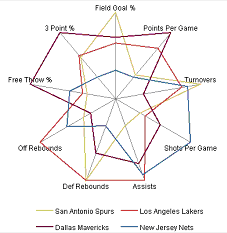
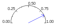
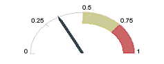
| Polar Chart Properties | value type | effect |
| manualSpoking | true|false | If defined, you are responsible
for determining
how many "spokes" should be drawn in this chart's axis
representation. Otherwise, there's a spoke for each item in the
largest dataset. |
| numSpokes | integer | The number of spokes in this chart's Axis system (default 4) |
| Property | value type | effect |
| datasetNType | Bar|Area | dataset N will be either Bar or Area, based on this value. |
| stackedBar | true|false | If "true", bars will be stacked, one series upon another. |
| barBaseline | double | bars ascend or descend from this value |
| barClusterWidth | double | This determines how wide each bar should be. If the value is 1.0, bar 1 will touch bar 2. If the value is 0.5, each bar will take 50% of the available space. If you have more than one data series defined, this value describes the total width of a cluster of bars. |
| barLabelsOn | true|false | determines whether labels will be drawn above each bar |
| barLabelAngle | integer | degrees to rotate bar labels |
| barLabelPrecision | integer | digits of precision for the bar labels |
| useValueLabels | true|false | determines whether the bar labels will be dataset labels or y values |
| Property | value type | effect |
| datasetNType | Bar|Line | dataset N will be either Bar or Line, based on this value. |
| stackedBar | true|false | If "true", bars will be stacked, one series upon another. |
| barBaseline | double | bars ascend or descend from this value |
| barClusterWidth | double | This determines how wide each bar should be. If the value is 1.0, bar 1 will touch bar 2. If the value is 0.5, each bar will take 50% of the available space. If you have more than one data series defined, this value describes the total width of a cluster of bars. |
| barLabelsOn | true|false | determines whether labels will be drawn above each bar |
| barLabelAngle | integer | degrees to rotate bar labels |
| barLabelPrecision | integer | digits of precision for the bar labels |
| useValueLabels | true|false | determines whether the bar labels will be dataset labels or y values |
These charts assign each data
representation (e.g. bar, or area) to a separate axis. These
charts use "auxAxis" as a property prefix to control the auxilliary y
axis. For example, to
change the auxilliary axis title one would use the property "auxAxisTitle", and to set options
like logScaling or gridOn, you would use the property "auxAxisOptions". When "auxAxis" is
used it always denotes the axis that
is by default on the right side of the chart.
This axis scales the
Bar data in each of these charts.
| Property | value type | effect |
| datasetNType | Bar | Line | Area |
The determines the
DataRepresentation for datasetN. The possibilities are limited to your
choice of Twin Axis Chart and coincide with the name of the applet or
server chart. For example, Area is not available for
twinAxisBarLineApp. |
| barBaseline | double | bars ascend or descend from this value |
| barClusterWidth | double | This determines how wide each bar should be. If the value is 1.0, bar 1 will touch bar 2. If the value is 0.5, each bar will take 50% of the available space. If you have more than one data series defined, this value describes the total width of a cluster of bars. |
| barLabelsOn | true|false | determines whether labels will be drawn above each bar |
| barLabelAngle | integer | degrees to rotate bar labels |
| barLabelPrecision | integer | digits of precision for the bar labels |
| useValueLabels | true|false | determines whether the bar labels will be dataset labels or y values |
| areaBaseline | double | sets the baseline value for this area |
By assigning lines (or sticks, in the
case of twinAxisDateComboApp) to two different axes, these charts allow
you to compare trends with two very different ranges of data.
These charts use "auxAxis" as a property prefix to control the auxilliary y axis. For example, to change the auxilliary axis title one would use the property "auxAxisTitle", and to set options like logScaling or gridOn, you would use the property "auxAxisOptions". When "auxAxis" is used it always denotes the axis that is by default on the right side of the chart.
There are several ways to supply
timestamp data for twinAxisDateLineApp and twinAxisDateComboApp.
You can use dataset properties, such as dataset0dateValues to define
a set of timestamps using inputDateFormat
to describe formatting. You can also use raw numeric
values (the number of milliseconds since 1970 UTC) for dataset0xValues. If you're
implementing a DataProvider or
overloading one of the getDataset()
methods, you can create datasets using java.util.Date objects or
java.sql.Date objects. These charts can take
advantage
of generalized
date chart properties
and date
chart axis
properties.
| Property | value type | effect |
| datasetNType | Line | Stick | Stick can only be used in
twinAxisDateComboApp. Stick data can be assigned to left or right
axes. |
| datasetNonRight | true|false | This determines whether this dataset will be assigned to the standard left axis or the auxilliary right axis. |
| plotLinesOff | anything | Create a scatter plot by making plot lines invisible. |
| auxPlotLinesOff | anything | Create a scatter plot by making
plot lines
invisible (for plot lines assigned to the auxiliary axis). |
| barBaseline | double | sticks ascend or descend from this value in twinAxisDateComboApp |
| auxBarBaseline | double | sets the baseline value for the Sticks assigned to the aux axis in twinAxisDateComboApp |
| barWidth | integer | sets the width in pixels of the Sticks in twinAxisDateComboApp |
| auxBarWidth | integer | sets the width in pixels for the Stick's assigned to the aux axis in twinAxisDateComboApp |
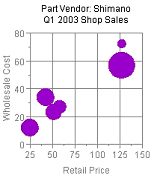
The diameter scaling is done
automatically to
prevent bubbles from flowing off of the chart or covering too much of
the plotarea, but this autoscaling can be
turned off to allow manual scaling as well. The chart also allows you
to specify where the X and Y axes should cross.
| Property | value type | effect |
| fillBubbles | true|false | determines whether the bubbles will be solid or just circles (default is true) |
| zAutoScaleOff | true|false | determines whether autoscaling will be used to size the bubbles based on the y2 values (default is false) |
| maxDiameter | double | this works in conjunction with autoscaling by limiting the maximum diameter of any bubble as a decimal percentage of the plotarea size (default is 0.25) |
| setZScale | double | when z scaling is turned off, this number will be the multiplier determining the sizing in pixels of the bubbles. For example with manual scaling, a y2 value of 10, and a zScale value of 0.5 will size the diameter of the corresponding bubble at 5 pixels. |
| crossAxes | true|false | if set to true the axes will be drawn so that they cross at a user defined point (default is false) |
| xCrossVal | double | when crossAxes is set to true, this value determines the location where the y axis will cross the x axis (default is zero) |
| yCrossVal | double | when crossAxes is set to true, this value determines the location where the x axis will cross the y axis (default is zero) |
| useValueLabels | true|false | determines whether the bubble labels will be the dataset text labels or the z/y2 values (default is false) |
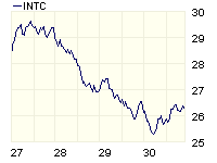
| Property | value type | effect |
| dataset0Type | ohlc|line|stick|candle | Sets dataset 0 (0 through 39 available) to one of: open-high-low-close, line, stick, or candlestick data representations |
| dataset0Window | Integer | Assigns
dataset 0 to a particular window. Windows are numbered sequentially
starting with 0. |
| dataset0VisibleInLegend |
true|false |
Determines
whether an icon for dataset 0 will be shown in the chart’s legend. |
| window0HeightFactor |
number |
Value
from 0.0 to 1.0 describes how much of the total charting area should be
devoted to window 0. |
| window0Color |
Color |
The
color for window 0’s plotarea |
| window0AxisFormat |
symbol|percentage |
If
set, this property changes the Y axis format for window 0 to be
percentages, or a shorthand symbol (1M for 1 million, for example) |
| window0AxisOptions |
List |
Similar
to yAxisOptions, etc. from the standard applets and imaging beans |
| window0AxisStart |
number |
Similar
to yAxisStart from the standard applets and imaging beans |
| window0AxisEnd |
number | Similar
to yAxisStart for standard applets and image beans. |
| window0AxisGridColor,
tickColor, titleString, titleFont, etc. |
Various |
All
“window0Axis” options apply to the Y axis for window 0 as the “yAxis”
options apply to a conventional applet or image bean. |
| window0XLabelsVisible |
true|false |
Determines
whether X axis labels should be displayed for window 0. |
| window0DisplayEndValue |
true|false |
Determines
whether the final values of datasets in window 0 should be displayed at
the right hand side of the chart. The first example above shows this
property in use. |
| endValuePrecision |
int |
Integer
precision for the end value |
| endValueUsesDollarSign |
true|false |
Determines
whether the end value should be preceded by a dollar sign. |
| endValueUsesPercentageFormat |
true|false |
Determines
whether the end value is displayed as a percentage. |
| window0ThresholdLineValues |
List
of numbers (e.g. “23.0,32,5”) |
Threshold
lines will be displayed at these locations in window 0. |
| window0ThresholdLineColors |
List
of colors |
Color
assignments for the threshold lines described in the previous property |
| window0ThresholdLineStyles |
List
of SOLID|DASH, e.g “SOLID,SOLID" |
Line
style assignments for the threshold lines described above. |
| indicatorThreshold |
Number |
Values
in dataset 1 that pass within this amount of threshold line 0 in window
1 will trigger buy or sell indicators along dataset 0. This behavior is
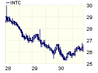
shown in the first chart example above. |
| stripeGrids |
true|false |
If
true, the X axis will use alternating colors, like the first chart
example above. The default behavior is shown in the other chart
examples. |
| gap |
Number |
This
is a percentage value (e.g. 0.05) that describes how big the gap
between chart windows should be. |
| dayFormat,
monthFormat, yearFormat, hourFormat |
Date
format string, e.g. "yyyy", or "MM-yy" |
This
format string describes how time stamps on the X axis should be
formatted. See the applet and server bean sections above for more
information about date format strings. |
There are several ways to supply
timestamp data. You can use dataset properties, such as dataset0dateValues to define
a set of timestamps using inputDateFormat
to describe formatting. You can also use raw numeric
values (the number of milliseconds since 1970 UTC) for dataset0xValues. If you're
implementing a DataProvider or
overloading one of the getDataset()
methods, you can create datasets using java.util.Date objects or
java.sql.Date objects. If you're creating a Java data interface,
your Datum objects should be instances of CandlestickDatum.
If you use the default "customDatasetHandler", these charts
take data from a single
file
or URL. The first column in the file contains dates. Additional columns
are assumed to be high, low, open, and close values.
These charts can take advantage of generalized date chart properties and date chart axis properties.
| Property | value type | effect |
| dataset0highValues | list | the high values for this dataset |
| dataset0lowValues | list | the low values for this dataset |
| dataset0openValues | list | the open values for this dataset |
| dataset0closeValues | list | the close values for this dataset |
| barClusterWidth | double | for candlestick charts this determines the width of the bar portion of the candlestick as a decimal percentage of total available space (see bar chart properties for a full description). |
| xAxisBarScaling | true|false | if true (default) this causes the x axis to scale as with any bar chart providing extra blank space on each end of the axis to allow for bar width. |
| Property | value type | effect |
| datasetNType | HLOC|Stick|Line | dataset N will be either Stick, HLOC, or Line, based on this value. (finComboApp only). |
| splitWindow | true|false | if true (default) each dataset type will be in a a separate window with an independent Y axis. The X axis will be shared among all dataset types. |
| Property | value type | effect |
| dataset0startDates | list | a list of values determining the start dates of the bars for this dataset |
| dataset0endDates | list | a list of values determining the end dates of the bars for this dataset |
| labelsOn |
true|false |
determines
whether labels will appear at each bar (defined with dataset0Labels) |
| barClusterWidth |
number |
ranges
from 0 to 1, defining the relative width of each dataset. 1.0
creates bars without any space between datasets. The default
value is 0.8. |
| individualColors |
true|false |
if
"true", this chart will use colors from dataset0Colors. Otherwise
the chart will have one color per dataset. |
| dwellLabelDateFormat |
String |
a
formatting string to describe the chart's start/end dates in dwell or
tooltip labels |
| dwellStartString |
String | This
string defines the dwell label string for the start date. In an applet, this
string should have a '#' character where the date will occur. With a
server-side chart use 'XX' in place of '#'. Default is "Start #" |
| dwellEndString |
String | This
string defines the dwell label string for the end date. In an applet, this
string should have a '#' character where the date will occur. With a
server-side chart use 'XX' in place of '#'. Default is "End #" |
| dwellIndefiniteString |
String | This
string defines the dwell label string for an indefinite start/end. Default
is "Indefinite" |
The color of the sectors can be
controlled by
either the dataset or datum colors, or x data values can be used to
create a gradient based on the dataset max/min values. When using X
values to determine sector color, a two color gradient will be used
from the min X value to the max X value and the color of the sector
will be based on its position between those values. The color at the
max X value can be set using dataset0FillColor; the color at
the min X value can be set using the sectorSecondaryColor property or
the dataset0SecondaryColor property (provided you are using Java 1.2
or higher).
There is also an option to break up the
coloring into two gradients
using the
baseValue and baseColor properties, which can be used for accentuating
x values above or below a threshold. Values above and below that
threshold will use a color that differs from the baseColor in relation
to the distance from the baseValue.
Sector map charts can also use any general
chart properties,
except, of course, things like axis properties that don't apply.
| Property | value type | effect |
| baseColor | Color | The color used to split up X data gradient coloring into two segments |
| baseValue | double | A threshold value for x data gradient coloring |
| individualColors | true|false | determines whether sectors will use Datum colors or Dataset colors |
| gradientColoring | true|false | determines whether sectors will use X data values to define sector color based on a gradient from the min X to the max X values |
| labelStyle | integer | Sets the label style for the sectors. Available values are 0 for Y value labels, 1 for X value labels, and 2 for standard String labels. |
| sectorSecondaryColor | Color | Sets the color used during X data gradient coloring for the X min data value |
Note: You can also create
histograms with KavaChart ProServe's histogram data filter tag. Other tags
are designed to generate other types of meta-data to
facilitate regression analysis, pareto charts, percentage change charts,
and so on.
| Property | value type | effect |
| binSize | double |
the
size of each bin. By default this value is calculated using
standard statistical techniques. Your definition overrides the
automatic value. |
| barClusterWidth |
double |
like
bar charts, this value determines how wide each bin's bar should
be. This value ranges from 0 to 1.0, and is usually set to 1.0
for a typical histogram. |
| backtesetData |
list
of doubles |
You
may want to compare the actual values against a set of backtest control
data. These numbers are represented as a line that overlays the
histogram. |
| lastObservationColor |
Color |
the
color of a marker that displays at the last observed value. |
| backtestDataName |
String |
a
string that describes your backtest data. Displayed on the chart
as explanatory text. |
| backtestDataURL |
URL |
a
URL or file that contains a comma-delimited list of numbers describing
your backtest data. |
| Property | value type | effect |
| LCL | list of doubles |
values that describe a lower
control line |
| UCL | list of double | values that describe an uper
control line |
| XBar | number | value for XBar line |
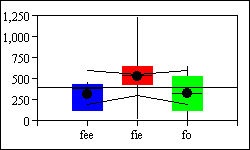
| meansVisible | true|false | determines whether means should
be displayed along with medians in Box-whisker. |
| Property | value type | effect |
| barAxisStart,
barAxisEnd, barAxisOptions, etc. |
various | Options
for the bar axis begin with the prefix "barAxis", but are otherwise the
same as options for xAxis and yAxis. |
| barClusterWidth |
double |
like
bar charts, this value determines how wide each bin's bar should
be.
This value ranges from 0 to 1.0, and defaults to 0.8. |
| barLabelsOn | true|false |
determines
whether labels should be displayed on each bar. |
| lastObservationColor |
Color |
the
color of a marker that displays at the last observed value. |
| barLabelAngle |
integer | rotate
bar labels to this angle. |
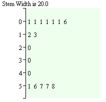
| Property | value type | effect |
| stemWidth |
double |
Sets
the numeric "width" of each stem. |
| roundValues |
true|false | if
"true" this chart will round leaf values to integers, rather than
displaying the entire numeric fraction. |